What if There's an App That Helps You Fight Climate Change? (Part 4: Using ICE Scores to Prioritize Features)
What features will be included in the initial launch of the app?
In my last update, I listed 11 potential features for the app. However, having all of them built for the initial launch would not only be nearly impossible, but overwhelming to the users.
There are numerous methods to narrow the list down, many of which involve user research and testing to make data-driven decisions.
However, when you haven’t released the app yet, these options can be limited. When you don’t have enough user data, one way to gauge which feature would be more essential is the ICE scoring method.
ICE Score = Priority
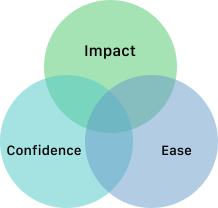
ICE framework let you estimate where each feature stands relative to other features on the same list, even when you don’t have a lot of data to work with. You give each feature a score (usually from 1-5) for Impact, Confidence, and Ease, and add them up for a final ICE score.
To demonstrate what each factor exactly represents, here are the questions I ask to measure impact, confidence, and ease.
Impact
How much will the metrics change from this feature? (In our case, “How many more people will take daily actions if we build these features?”)
Confidence
How sure are you that this feature will generate the expected impact?
Ease
How much resource do you need to build this feature?
In a group setting, I would invite my whole team to join in and ask these questions for every feature. It can take quite a bit but I consider this to be one of the most important discussions - in my experience, it’s a proven tactic to have everyone work happily and efficiently as they all understand why these features are important.
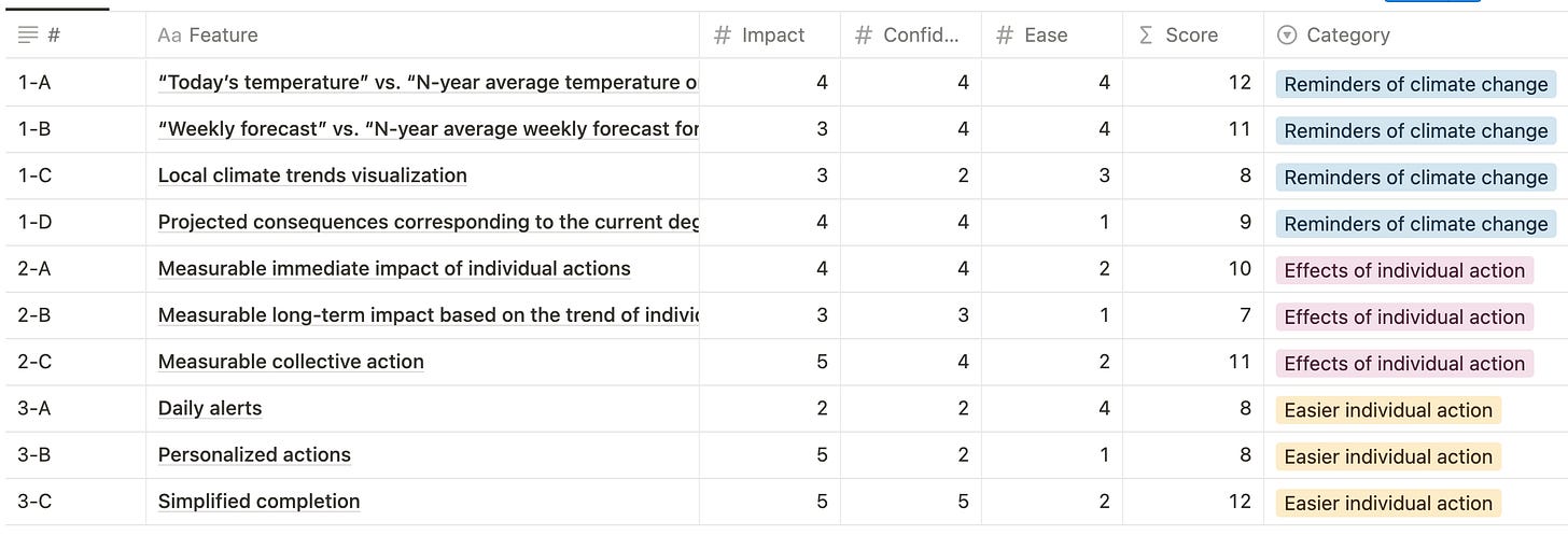
My ICE Table
I will share one example of how I came up with these scores so you can take a glimpse of the thought process.
Feature: Showing “Today’s temperature” vs. “N-year average temperature on the same day” (1-A) & “Weekly forecast” vs. “N-year average temperature for the same week” (1-B)
Impact: 4
Confidence: 4
Ease: 4
Impact: Displaying today’s temperature and comparing it with historical temperature means that this feature will be refreshed daily with new information. It can be also used like a weather app - one of the most widely used feature on smartphones. With frequently updated information, and a proven popularity for a feature that shares the same roots (weather app), I gave an impact score of 4.
Confidence: I don’t think there’s any more direct way to tell people that climate change is affecting their area, than to show them how the current weather in their own town is an anomaly compared to history. For this (rather personal) reason, I gave a confidence score of 4.
Ease: All that I would need to implement this feature is a weather forecast API, and a reliable database on historical weather, so I gave an ease score of 4
Final Results
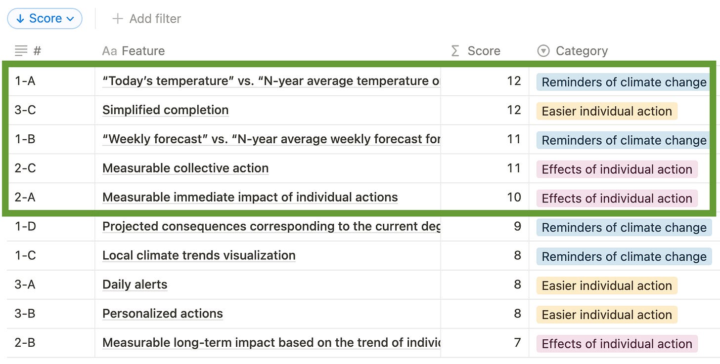
The table looks like below after sorting the features by their final ICE score.
The top 5 features, coincidentally spread across all three categories - focusing on the top 50% of the list sounds like a good start!
Next Step: Flow
If you’ve been thinking, “This is too much writing, when will I get to see some action?” you’re in for a treat. Now that I have the final features set up, I will bring all the ingredients together, build some blueprints for the app architecture and flow.


